Overlooked

Once nestled between two major mines, Overlooked has grown into a leading mining force. As it advances, the company remains committed to investing in, empowering, and uplifting those who are often overlooked.
We were asked to design the logo and full corporate identity for Overlooked Group. The visual identity should reflect the group's values, ambition, and industry relevance. Additionally, define a strong positioning statement that clearly communicates the group's purpose, value proposition, and unique market role.
🔍 Surface observation
Design a bold, confident logo that reflects a forward-moving, future-focused organization. The mark should convey strength, momentum, and a clear sense of purpose.
🤔 Deep observation
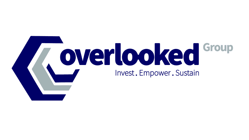
Connected 'oo': The linked 'o's on the logo symbolizes vision and forward-thinking, while also honoring the past, reminding us to be mindful of where we come from.
Hierarchy of Identity: The Group name is treated as the mother brand and appears slightly larger (by 1 point) than the names of its subsidiaries, visually reinforcing its leadership and central role.
Core Message: The slogan serves as a constant reminder of our foundational pillars, embedding purpose and values into the identity itself.

Overlooked Group is a diversified, 100% Black-owned mining company—driven by more than just profit. Since inception, we've been rooted in the belief that the South African dream lives within our purpose: to invest, empower, and sustain.
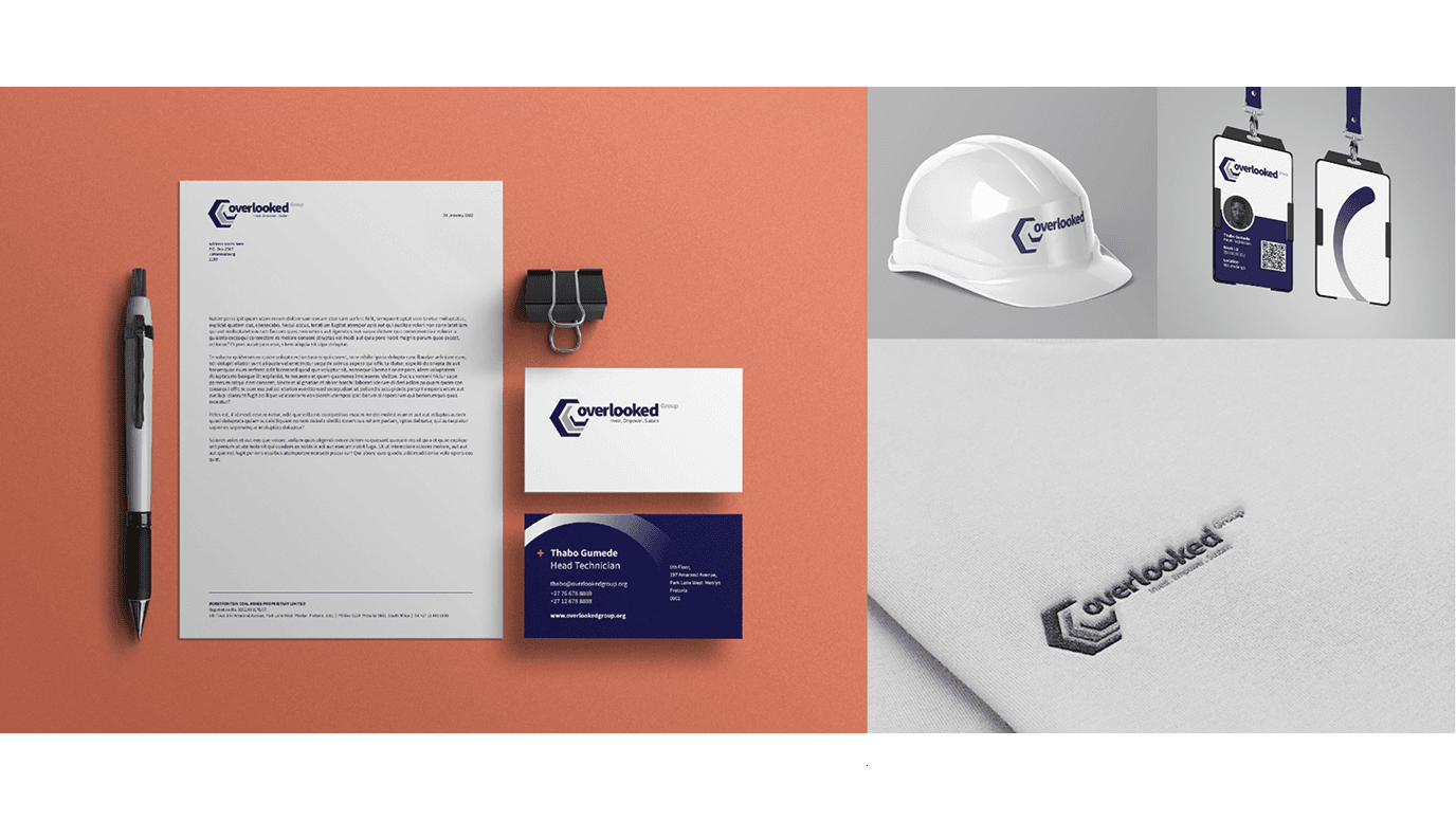
Together with the Overlooked team, we evolved the brand by building on existing elements while introducing a refreshed, forward-looking identity.
More info
Client
Overlooked Group
Industry
Mining
Project team
Tshimo Kgomanyane
Ndinannyi Siminya
Service(s)
Brand design


