A Re Yeng

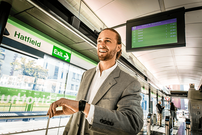
Public transport is the most widely used and accessible mode of travel in South Africa. The City of Tshwane is working to make it a more inclusive and user-friendly experience for all.
The City of Tshwane invited us to collaborate with their communications team to develop a marketing campaign for the launch of A Re Yeng—a reliable, customer-focused bus service that delivers fast, comfortable, and universally accessible transport across the city.
📝 Brief
Develop and design a marketing campaign to introduce a new Rapid Bus Transit (RBT) system to the public. The campaign should build awareness, generate excitement, and communicate the benefits of the service—such as speed, affordability, reliability, and accessibility.
👂 Consideration
Ensure alignment with the City's existing style guide and previously developed marketing materials to maintain visual and messaging consistency.
We collaborated with the City of Tshwane to co-create a unique identity for A Re Yeng — one that aligns with existing transit services while standing out in its own right.
🚌 Commuter types
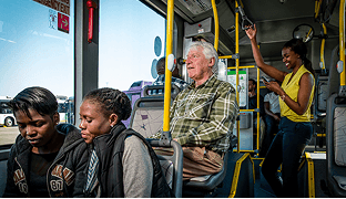
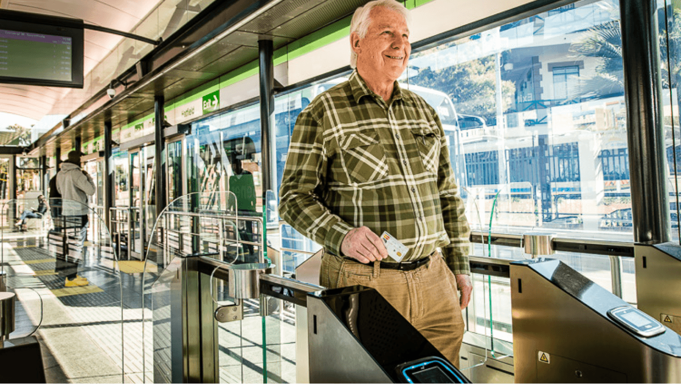
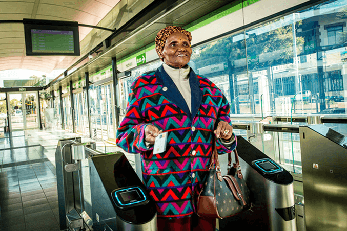
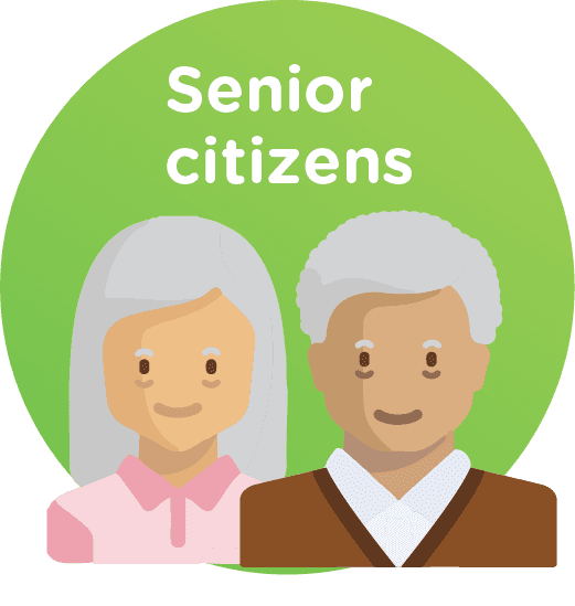
Pensioners
Pensioners aged 60 to 65 receive a 25% discount when traveling during off-peak hours.
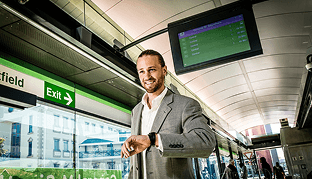
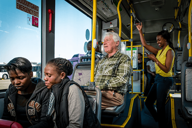
Young Professionals
Relax on board—catch up on emails or stay connected with family and friends while you travel.
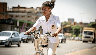
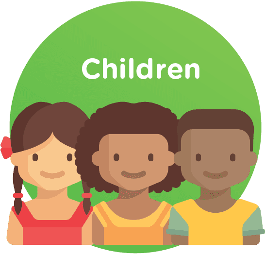
School children
Learners aged 5 to 19 pay a flat rate of 7 points for all trips.
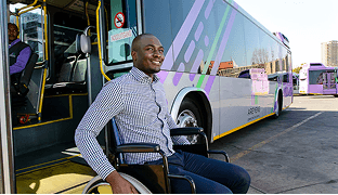
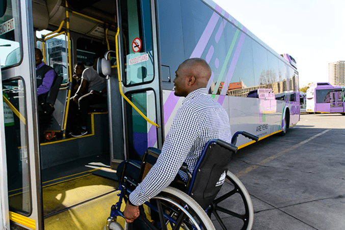
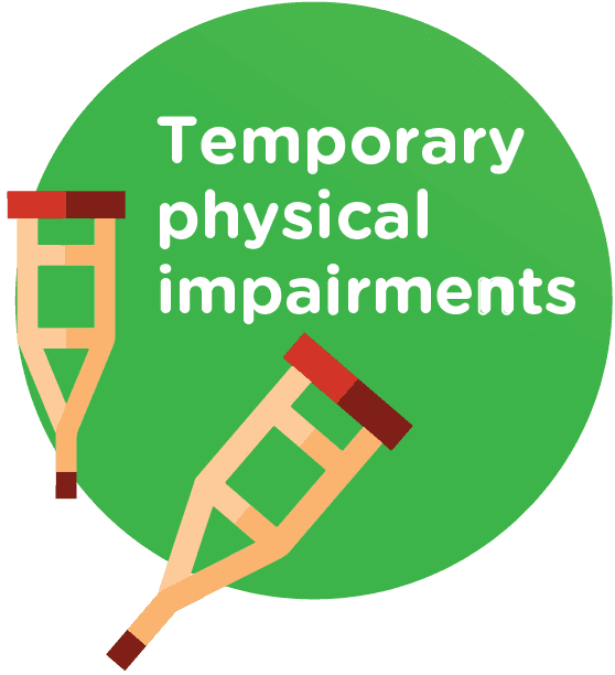
Physical disability
The A Re Yeng rapid transit system is built with universal accessibility at its core—designed, constructed, and operated for everyone.
📷 Art Direction
Our visual approach centered on the individual Tshwane traveler—aiming to create a sense of inclusion, visibility, and personal connection. Each image was crafted to ensure that viewers not only saw themselves reflected in the campaign, but also felt valued.
🌅 Key Visual Themes
👴👵 Pensioners: Imagery communicates how simple, safe, and cost-free it is for elderly citizens to use the service.
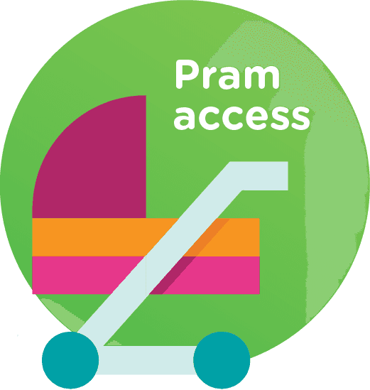
♿ Universal Access: Visuals highlight the ease and comfort of reaching one's destination with minimal effort, reinforcing accessibility.
🕒 On Time: Scenes showcase the reliability of A Re Yeng's dedicated bus lanes, reinforcing its promise of punctuality.
In the absence of suitable visuals, we created custom illustrations to represent the diverse Tshwane community. By including icons of various ethnic groups, we ensured the artwork felt inclusive and reflective of the city's residents.
🎨 Illustrations
🎨 Illustrations
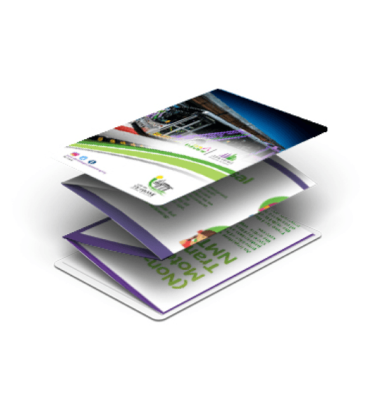
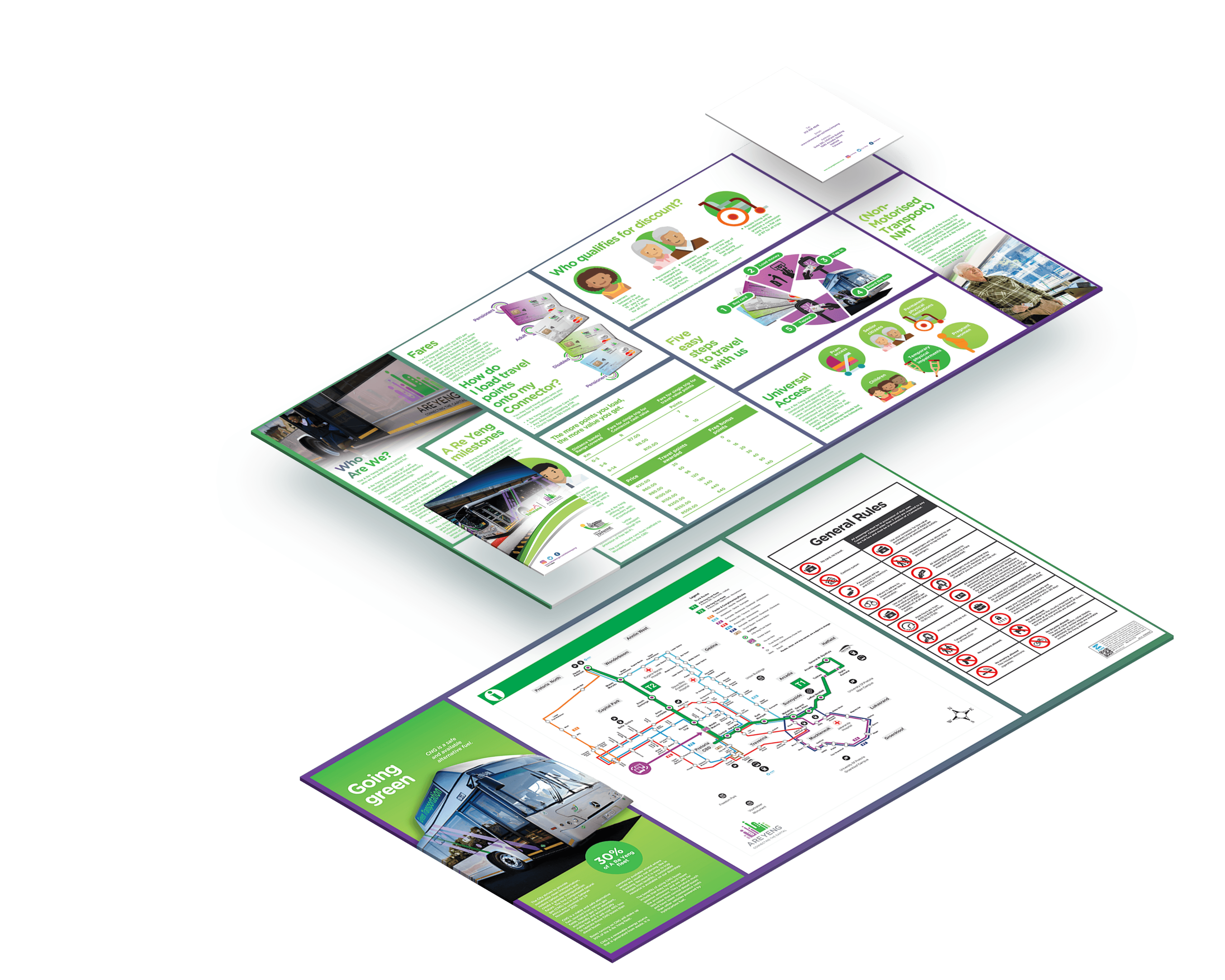
When designing the Z-Card, we prioritized inclusivity in both visuals and readability. Characters were illustrated as people of colour to reflect the City's demographics and commuter base. We also used larger font sizes for headings and body copy to support accessibility for elderly users and those with visual impairments.
More info
Client
The City of Tshwane
Industry
Government
Project team
Ratile Monareng
Ndinannyi Siminya
Service(s)
Information design


